Cubism is an interesting art
movement. It has lots of variations of the final look of art, which could be
clearly seen in two cubism paintings made with 6 years’ difference.
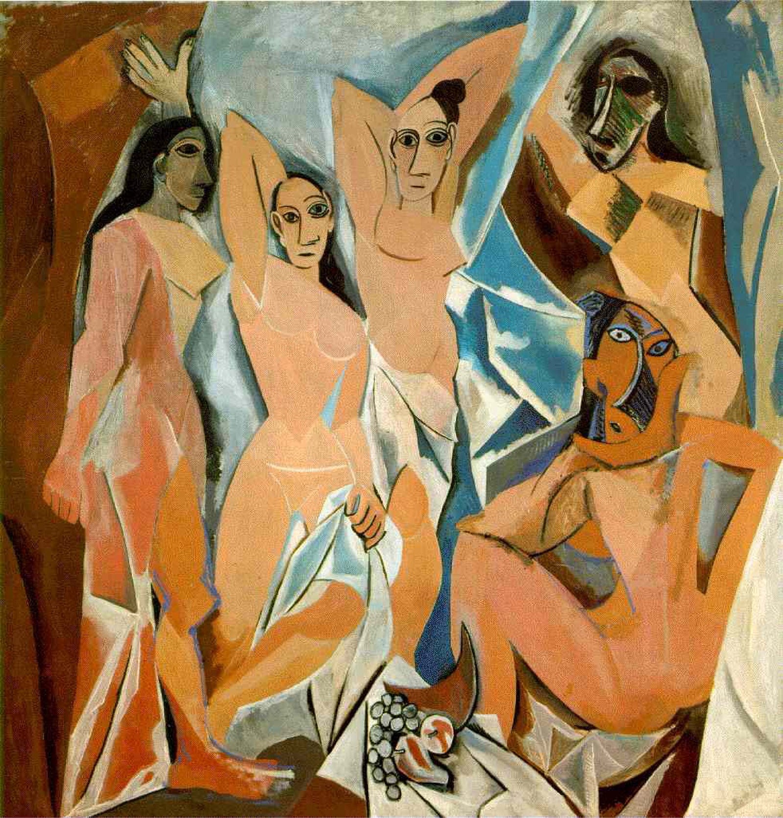
Les Demoiselles d’Avignon – is an artwork the cubism was born of.
The creature of Pablo Picasso made in 1907. It is made with a mixture of
different styles combined on one canvas. Five women are illustrated in the
picture, with a different style of faces and bodies, created in different ways.
Some of them look more realistic and more united, while others look a bit broken
and their bodies and heads are separated by different styles and colors. Even
so, the painting still looks like one.
Shapes could be clearly seen on
almost every fragment of the picture. Some of them have their own shadows and lightning,
making the depth for an object by itself, not for the figure created from it. I
could say Picasso’s artwork is comparable with a mosaic, created by oil for
some reason.
On the other hand, Juan Gris’s
painting looks absolutely different. You couldn’t easily say these two are
belonging to one ort movement.
In Glass of Beer and Playing Cards two views are combined. I guess it
is something cubism has in its idea. On Picasso’s painting, the woman at the right
corner was drawn from different positions. That why she looks broken and anatomically
wrong – each part of her body should be observed separately. She was made from
different positions, as an attempt to show the three-dimensional world using a
2D tool.
 The Glass of Beer and Playing Cards, made in 1913, seem to have the
same idea of representing something from different views. I would say this art
looks more like if the artist has been located at the middle of the room,
trying to illustrate north and south at the same time making only one drawing.
But the method of illustrating is completely different.
It is also interesting the parts
of pictures look pretty common. Things are not created from different geometrical
forms (in a clear way) and the perspective is one for the object itself.
The first thing you feel looking
at this artwork is it looks like a collage created from two paintings. It seems
like a frame sequence on the left, and as a few images damaged whit glitch or
bug on the other.
So both artworks seem to be made
with the idea of representing one object or place from the different views, and
while Picasso made something comparable to a collage, Juan Gris made a
collage-looking artwork. Both of them are created from smaller parts, but with
a different approach.

Комментариев нет:
Отправить комментарий